
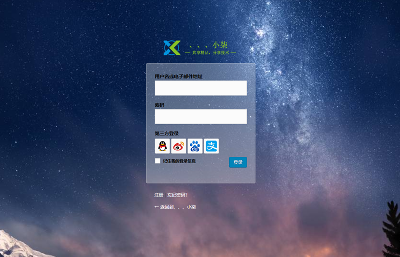 本站登录页面的美化效果:点击此处查看
首先打开你主题的functions.php文件,在最后添加上以下代码:
/**
* WordPress 登录界面美化
**/
function custom_login_style() {
echo '<link rel="stylesheet" id="wp-admin-css" href="'.get_bloginfo('template_directory').'/admin-style.css" type="text/css" />';
}
add_action('login_head', 'custom_login_style');
在新建admin-style.css并添加以下代码,然后上传至functions.php同目录下,刷新你的登录页面看看,是不是变美了!
body{
font-family: "Microsoft YaHei", Helvetica, Arial, Lucida Grande, Tahoma, sans-serif;
width:100%;
height:100%;
background: url(https://www.yangxingzhen.com/images/登录背景图.jpg) no-repeat;
-moz-background-size: cover; /*背景图片拉伸以铺满全屏*/
-ms-background-size: cover;
-webkit-background-size: cover;
background-size: cover;
}

/*顶部的logo*/
.login h1 a {
background:url(https://www.yangxingzhen.com/images/site_logo.png) no-repeat;
background-size: 220px 50px;
width: 220px;
height: 50px;
padding: 0;
margin: 0 auto 1em;
border: none;
-webkit-animation: dropIn 1s linear;
animation: dropIn 1s linear;
}

/*登录框表单*/
.login form, .login .message {
background: #fff;
background: rgba(255, 255, 255, 0.3);
border-radius: 3px;
border: 1px solid #fff;
border: 1px solid rgba(255, 255, 255, 0.4);
-webkit-animation: fadeIn 1s linear;
animation: fadeIn 1s linear;
}

/*登录框输入框*/
.login label {
color: #000;
}
.login .message {
color: #000;
}
#user_login{
font-size: 18px;
line-height: 32px;
}

/* 返回博客与忘记密码链接 */
#backtoblog a, #nav a {
color: #fff !important;
display: inline-block;
-webkit-animation: rtol 1s linear;
animation: rtol 1s linear;
}

/*掉落的动画效果*/
@-webkit-keyframes dropIn {
0% {
-webkit-transform: translate3d(0, -100px, 0)
}
100% {
-webkit-transform: translate3d(0, 0, 0)
}
}
@keyframes dropIn {
0% {
transform: translate3d(0, -100px, 0)
}
100% {
transform: translate3d(0, 0, 0)
}
}

/*逐渐出现的动画效果*/
@-webkit-keyframes fadeIn {
from {
opacity: 0;
-webkit-transform: scale(.8) translateY(20px)
}
to {
opacity: 1;
-webkit-transform: scale(1) translateY(0)
}
}
@keyframes fadeIn {
from {
opacity: 0;
transform: scale(.8) translateY(20px)
}
to {
opacity: 1;
transform: scale(1) translateY(0)
}
}

/*从右往左的动画效果*/
@-webkit-keyframes rtol {
from {
-webkit-transform: translate(80px, 0)
}
to {
-webkit-transform: translate(0, 0)
}
}
@keyframes rtol {
from {
transform: translate(80px, 0)
}
to {
transform: translate(0, 0)
}
}
若文章图片、下载链接等信息出错,请在评论区留言反馈,博主将第一时间更新!如本文“对您有用”,欢迎随意打赏,谢谢!
继续阅读
Wechat
微信扫一扫,加我!

微信号已复制
微信公众号
微信扫一扫,关注我!

公众号已复制
评论